A One-Page Poster for a Busy Noticeboard
A one-page poster for a busy noticeboard can make an event legible at a glance by giving its main message, date, place and next action a clear order.
The common mistake with a one-page poster for a busy noticeboard is giving every detail the same visual weight. A passer-by sees a crowded block of names, dates and explanations, cannot tell where to begin and keeps walking. The cost is practical: the event’s invitation disappears before anyone reaches the details needed to act.
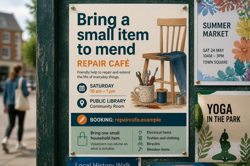
Imagine a neighbourhood repair café planning a Saturday session at the public library. The organisers have a name, a short description, a date, a room, a booking address, a list of repair types and a request to bring small items. They need one poster that explains the offer at a glance and makes the useful details easy to find.
Start with the decision a passer-by needs to make
Before arranging type or choosing colours, write down the decision the poster should help with. In this imagined case, it is: “Could I bring something to mend, and can I get there?” That sentence is a working brief, not copy for the finished design. It puts the reader’s practical question ahead of the organisers’ wish to explain everything they have arranged.
Sort the available information into three groups:
- Invitation: a repair café where people can bring a small household item for help mending it.
- Essential logistics: Saturday, the session time, the library and the room within it.
- Supporting detail: the kinds of repairs, booking instructions and what visitors should bring.
This is a sorting tool, not a verdict that supporting details are unimportant. It helps decide what must be understood immediately, what can be read at closer range and what can be left out if the page feels crowded. A noticeboard poster has a specific job; it is not the event’s entire information pack.
Give the message the first glance
For the imagined repair café, a direct headline might read Bring a small item to mend. It names both an action and an offer. “Repair Café” can sit nearby as the event name, but on its own it may not tell a stranger what happens there. A useful headline reduces the effort of guessing.
Set the headline apart with scale, position and clear space around it. If the event name is already familiar to its audience, it may carry more of the first message; for a less familiar event, the plain-language offer deserves the prominent position. Let the words answer a likely question rather than trying to sound like a campaign slogan.
To check the hierarchy, cover the smaller copy with a sheet of paper. The visible headline should still make sense as an invitation. If it needs the fine print to explain the event, revise the headline before polishing the details.
Arrange the reading order around a glance
After the main message, a reader needs enough information to decide whether the event fits. In the imagined poster, the next layer might say Saturday, 10 am–1 pm · Public Library, community room. The booking address follows, then a compact note: “Bring one small household item; volunteers can advise on what is suitable.” These are invented sample details; the actual organisers must use confirmed information.
That sequence moves from offer to time and place, then to action. It also gives the booking detail a sensible role: important to someone planning to attend, but not a rival to the main message. A short line such as “Booking: repaircafe.example” is easier to scan than a sentence that buries the address in a paragraph.
On a noticeboard, other posters compete for attention. Someone may catch only the largest line at first, then look closer if it seems relevant. Design for both moments: a distinct headline for the first glance, followed by tidy, legible information. A quick view from across the room can expose a headline that disappears into its background; a closer read can reveal copy that is cramped or hard to follow.
Keep supporting details useful and calm
Posters often collect extra copy through good intentions. Organisers may want to name every volunteer, list every possible repair, explain the session and thank the venue. Those facts can belong elsewhere. Include a detail on this sheet if it helps the reader understand the offer, decide to attend or take the next action.
For the fictional repair café, “small household items” is more useful than a long inventory of objects and materials. It gives a sense of scope without implying that every item can be repaired. The booking address is useful if visitors need to reserve a place; if the session is open without booking, say so instead of sending people to an unnecessary sign-up page.
Use a short text hierarchy: headline, event name or clarifying line, logistics, then one brief instruction. Keep related facts together. The day and time belong in one block; the venue and room belong in another. Readers can then find a complete piece of information instead of assembling it from scattered corners.
A restrained palette can help distinguish these layers. A dark headline on a light ground and one accent colour for the booking prompt may be enough. The aim is not austerity; it is to stop colour, illustration and type treatment from competing with the words a reader needs.
Use a visual cue only when it clarifies the offer
A small drawing of a repaired chair or a spool of thread could suggest making and mending, but it should not carry information the wording fails to provide. A decorative border, a cluster of tool icons or a large photograph can make the page busier without helping anyone identify the event or locate its details.
Ask what each visual element contributes. Does it distinguish the repair café from a general market? Does it make the poster easier to recognise from a distance? Does it pull attention away from the date or booking address? If it mostly fills a gap, that gap may be useful breathing room rather than a design problem.
What is not worth the effort is finding a different icon for every repair type or inventing a complex visual system for one sheet. A single apt image, or no image, can serve the page better. Spend the attention on a clear headline, dependable wording and a reading order that survives a quick glance.
Check the poster at the noticeboard?
What should the reader notice first?
The headline should identify the event’s offer or the action it invites. If the reader sees only the event name and still has to guess what happens, make the supporting phrase more direct.
Which details belong on the page?
Keep the information needed to decide and act: what the event offers, when and where it happens, and how to attend or book. Move background explanation and long lists elsewhere if they do not change that decision.
How can a poster remain readable on a crowded board?
Set the headline apart from supporting copy, group related details and leave space between blocks. View the sheet from the distance at which people approach the board, then read it nearby to catch small or crowded wording.
What if the event has more information than fits?
Use a contact route or short link for details that do not belong in the main reading order. Keep the essential date, place and action on the poster so readers do not have to follow a link just to discover the basics.
Work through the poster checks before printing
Use each observation to choose whether to keep the draft, revise it or move information elsewhere:
- Check whether the headline names the offer or action; if it does, keep it, but if it only gives an unfamiliar event name, rewrite it in plain language.
- Check whether the date and time sit together; if they do, keep them as a block, but if they are separated, bring them together.
- Check whether the venue and room are both stated; if they are, keep the location block, but if either is missing, confirm and add it before printing.
- Check whether a reader can tell how to attend; if booking is required, show the booking route, but if it is not, say that no booking is needed rather than adding a redundant link.
- Check whether a repair list changes the reader’s decision; if a short description gives enough guidance, use it, but if a particular item needs explanation, move the longer list to the booking page or contact route.
- Check whether the headline remains clear when smaller copy is covered; if it does, preserve the hierarchy, but if it relies on fine print, revise the headline.
- Check whether the supporting copy is readable close up; if it is, keep its current grouping, but if it feels cramped, remove lower-priority words before shrinking every line.
See how a crowded draft can become easier to scan
Say the organisers start with a draft headed “Repair Café”, followed by a paragraph about volunteers, a long list of possible objects and the library address at the bottom. They first identify the reader’s decision: whether to bring an item and where to go. They then move “Bring a small item to mend” above the event name, group the confirmed Saturday time with the library room, replace the inventory with one concise note about small household items and give the booking address its own line.
The resulting draft has a clear offer at the top, logistics together and a distinct next action. The organisers can then cover the smaller copy to check that the headline still works, view the draft from the approach to the noticeboard and read it close up for cramped wording. If the venue or booking route is hard to find, they can adjust the layout; if the page still feels crowded, they can remove a lower-priority detail before shrinking the type. This imagined revision makes information easier to locate, without promising that every passer-by will attend or every item can be repaired.
Before printing, check the wording against the organisers’ confirmed details. If the event cannot promise that every item is suitable, say that volunteers can advise rather than implying a repair is certain. For a one-page poster for a busy noticeboard, the strongest edit is often the line that disappears: keep the invitation, essential logistics and next action, and let longer explanations live somewhere made for longer attention.